PORTFOLIO: WELLS FARGO
Products I've worked on at Wells Fargo are live and used by millions in the real world.

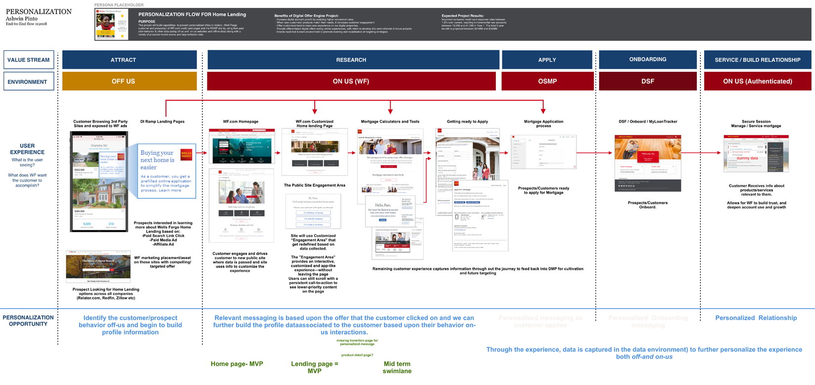
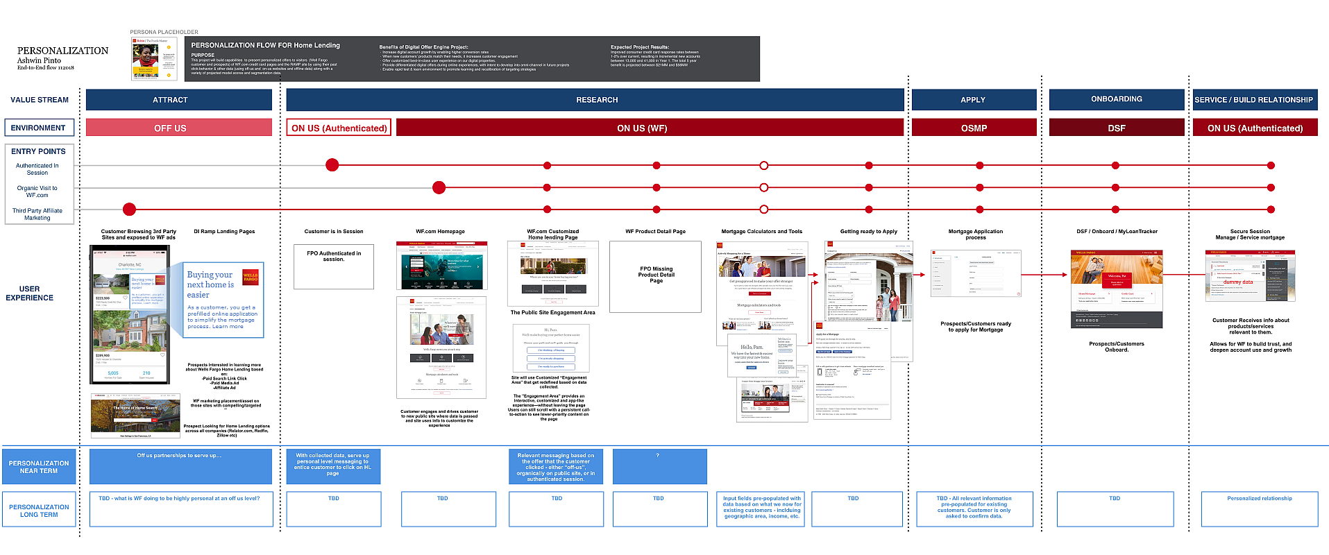
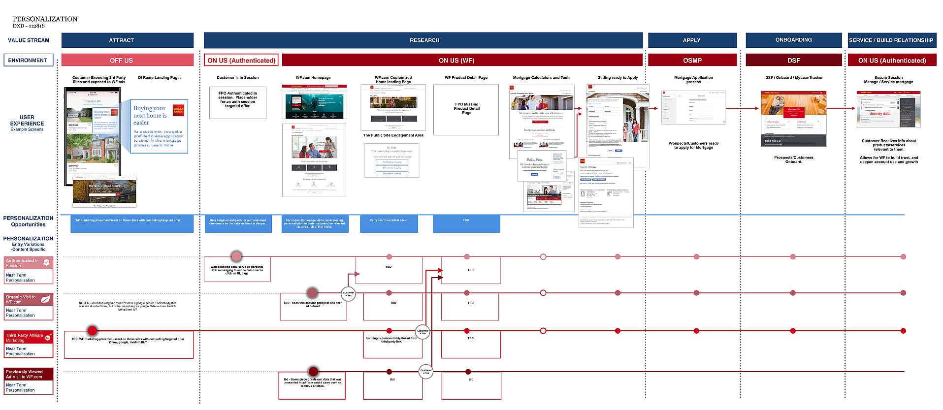
A TARGETED PERSONALIZED HOME LENDING SOLUTION
-
MORTGAGE PERSONALIZATION PROJECT: (AUTH/UNAUTH) MVP
1
- Problem: How to identify when existing users landed on Home Lending pages and understand where they were in the buying process.
- Solution: Leverage existing research and metrics to define target users and creating personalized landing pages for key segments.
- Process: Measure if/how personalized content
generated more engagement and conversions using machine learning and A.I..
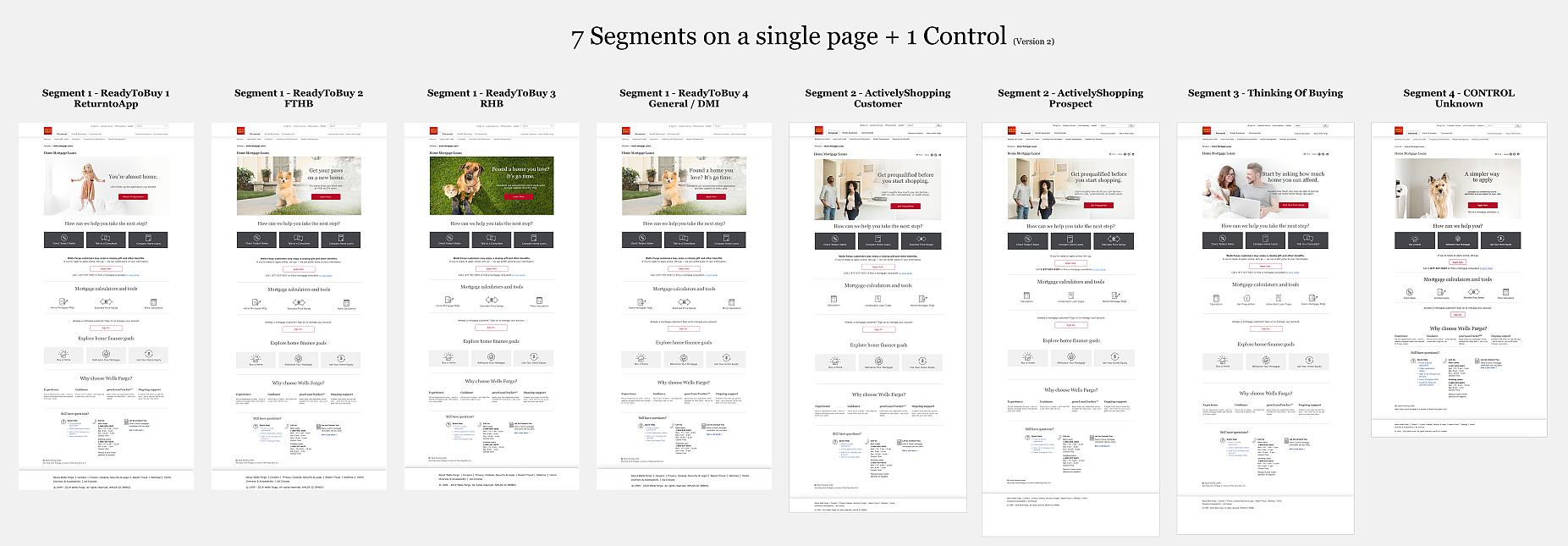
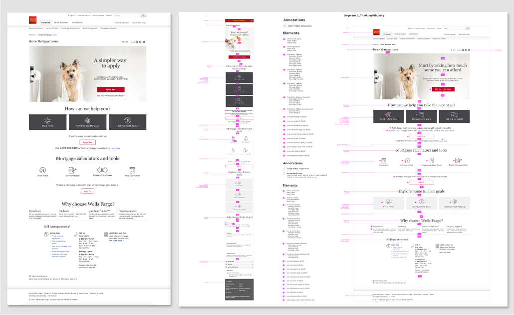
- Studying research to define key segments for 3 targeted pages.
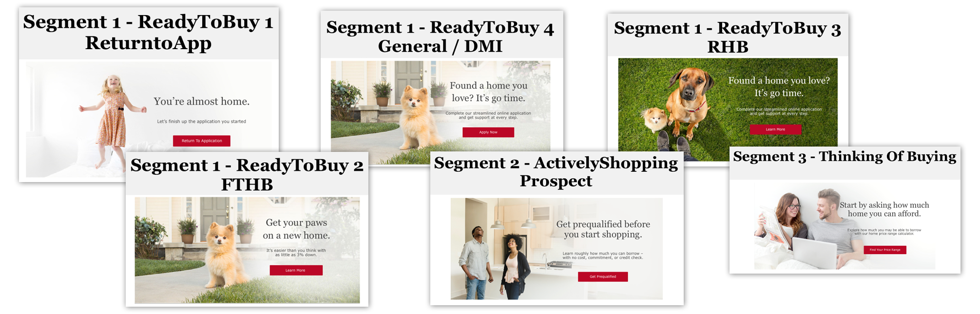
- Designing landing experiences for 7 unique segments based on where they were in the buying journey (Thinking of Buying, Actively shopping, or Ready to buy).
- Collaborating closely with Content Strategy and the RTTO team to define the content and test parameters to inform iterative prototypes.
- Delivering information architecture, visual content, wires, redlines to prototypes and socializing mockups and concepts throughout.
- Supporting designs through governance and accessibility to development - Success: MVP of personalized
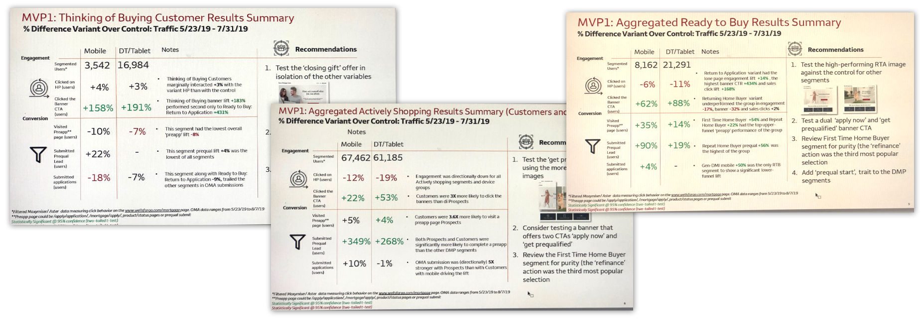
landing pages for 7 key segments launched 5/23/2019.
(Visit
the LIVE experience). It was considered a success, with
the new experience outperforming the control.
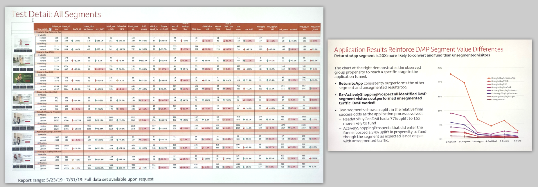
157% general increase in pre-qual lead submissions with 100% segments showing a lift (a couple RTTO test result findings below).
349% rise in the number of pre-approvals generated among actively shopping prospects and existing customers.
WELLS FARGO (2019)
AUTHENTICATED USER SAVINGS TRANSFER
-
MOBILE SELF-SERVICE SAVINGS TRANSFER
- The problem: was that a self-service option for the per transaction savings functionality didn't currently exist. Only through a teller or banker at a branch. Frustrating for existing customers.
- The solution: was to create a self-service functionality that transferred money to a savings account with every eligible transaction and an ability to link accounts.
- Process: Worked with LOBs and existing product owners and other stakeholders to create requirements, user stories and a strategy for POE. Tested it internally. Accessibility tested. Delivered to Dev.
- Created initial 'mobile first' wires in Figma and prototyped it for socialization (see below).
- When creating prototypes, I am mindful of the expectations that LOB has. Things they want to test specifically will be built out in extra detail, and also in line with 'the script' that the testing team and I agree upon.
- The product is currently in development, so I can't share too many details.
WELLS FARGO (2022)
EXAMPLE OF A JOURNEYMAP THAT I CREATED
-
END-TO-END CROSS PLATFORM JOURNEY MAP
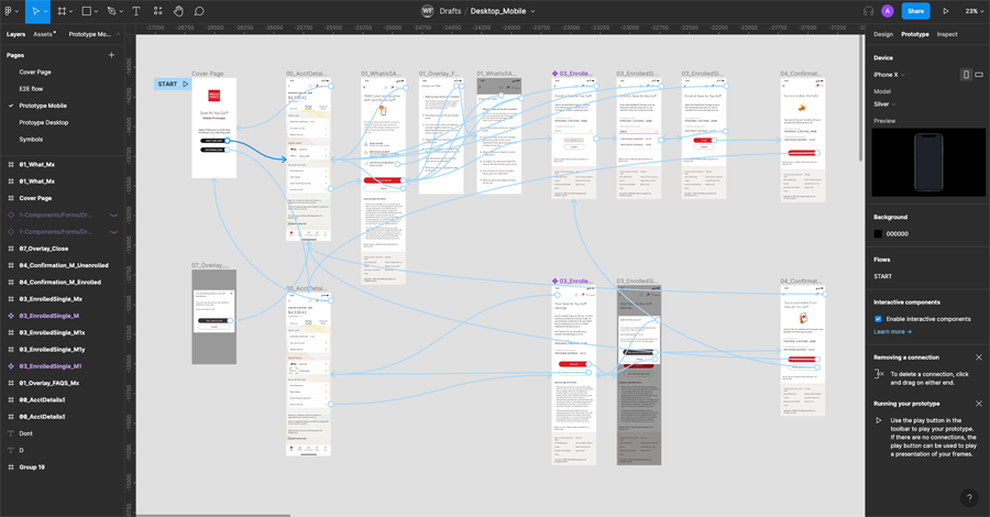
- This is something I do often when starting out a new project or product, depending on complexity. Things like this give everyone a 50ft view and help facilitate discussions. My goal is to SEE and then help others see.
- The project becomes much simpler when I create this cross platform, cross stream flow Journeymap, (see below) so stakeholders can see all the pages required and all the teams that we might have to reach out to for data and resources. I've done this for simple flows and for extremely complicated flows as well.
- A few examples of a journeymap for the personalization project, I worked on (see below).
WELLS FARGO (2018)
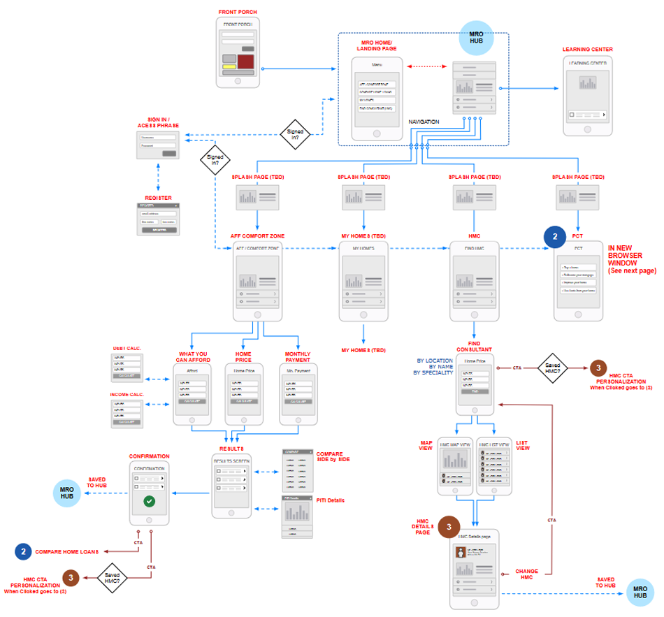
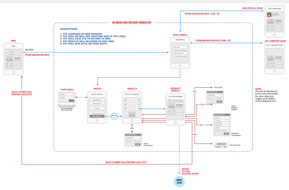
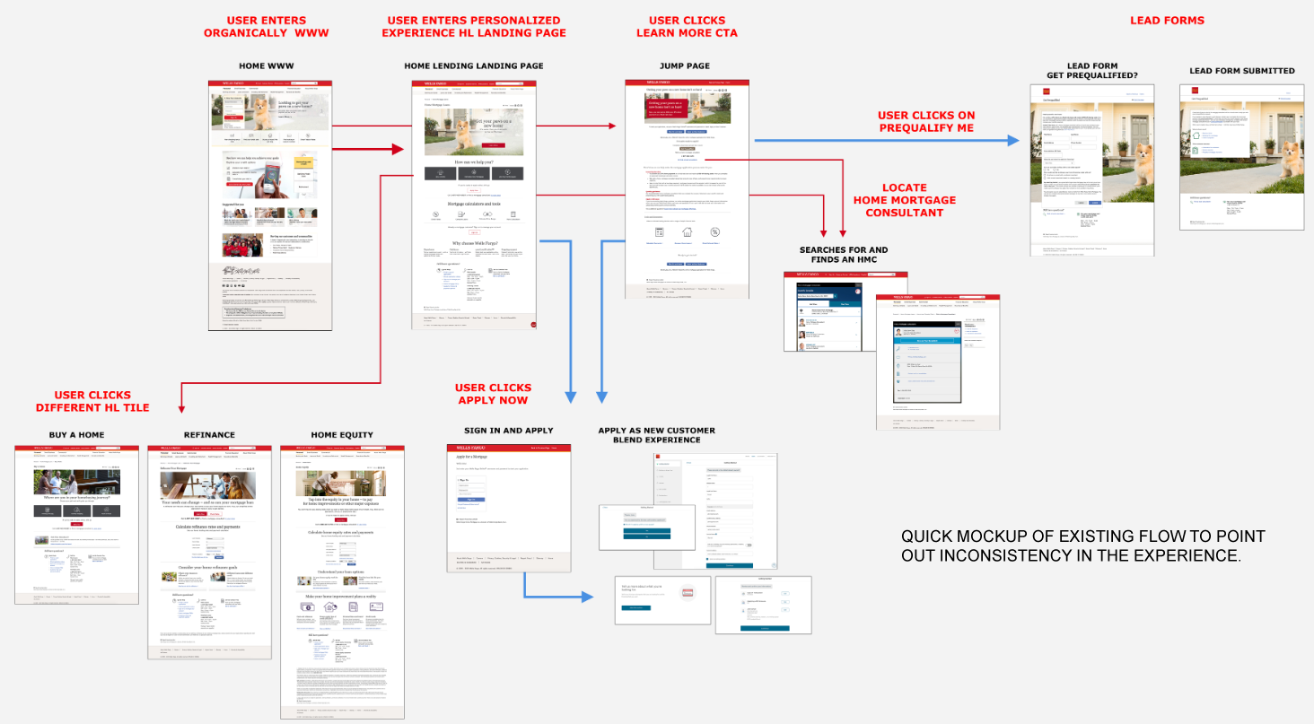
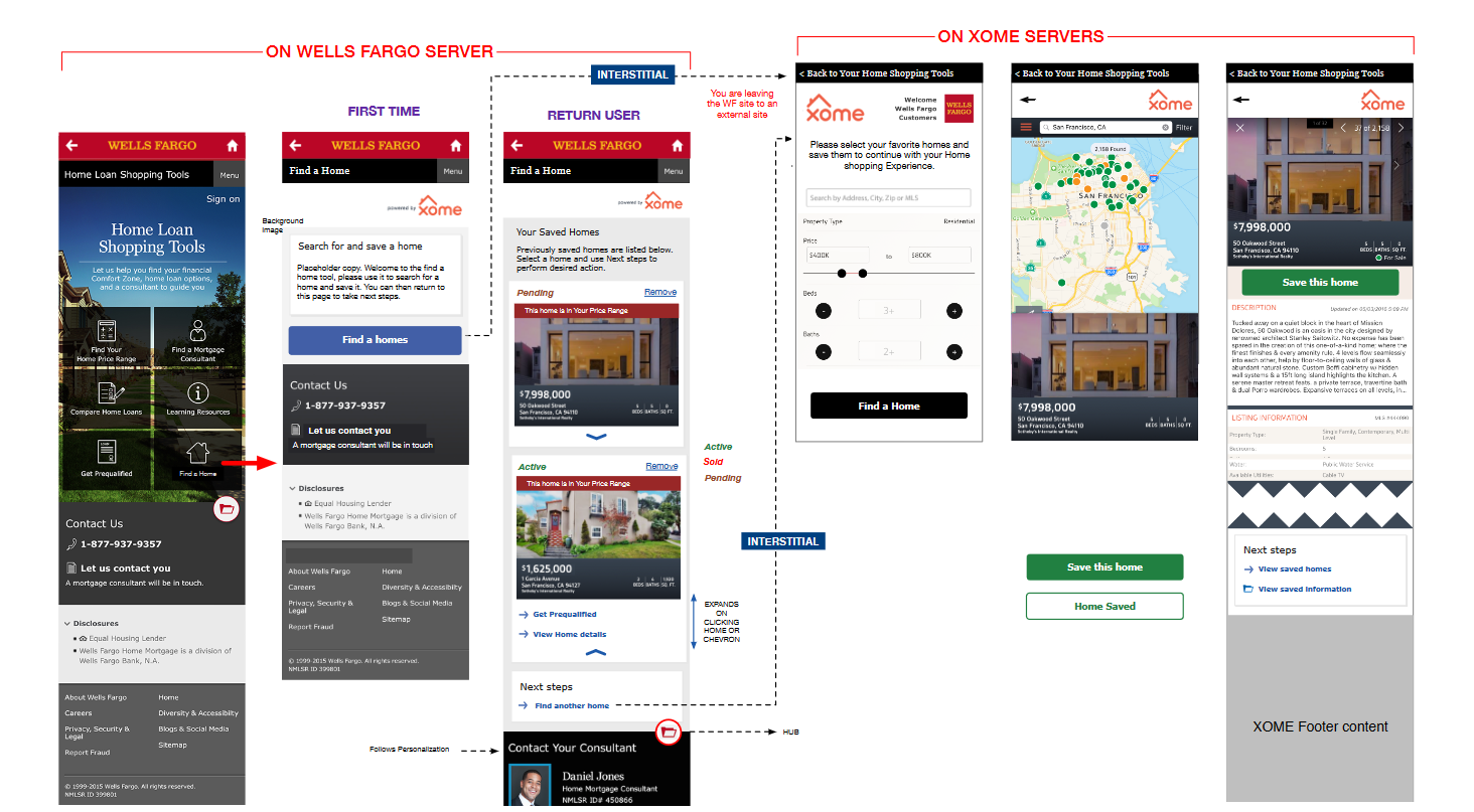
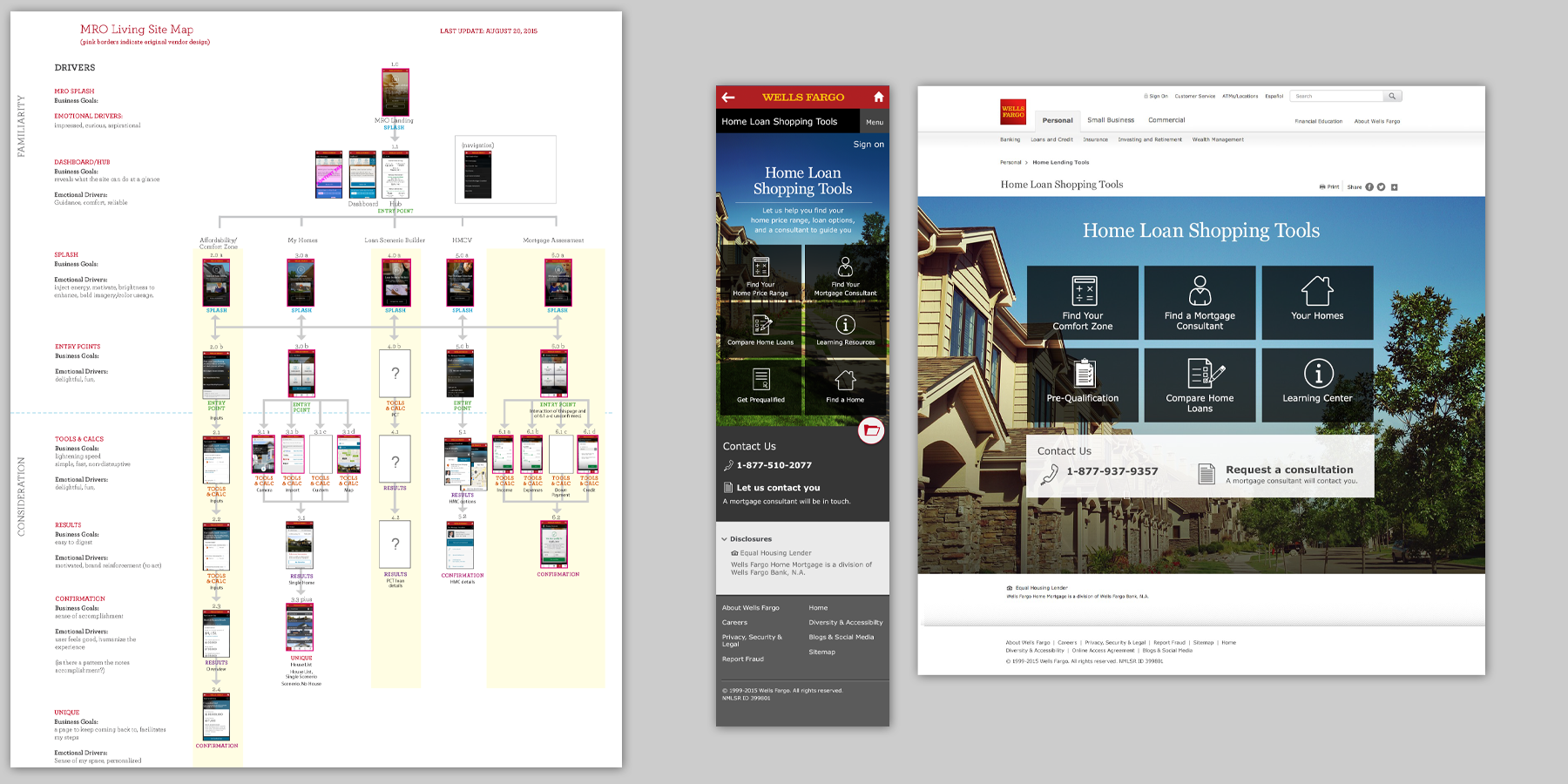
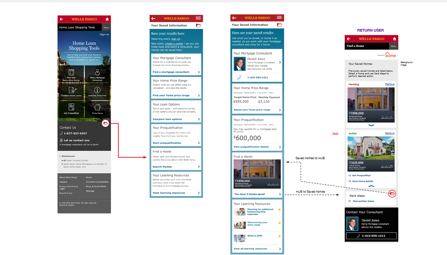
HOME LOAN SHOPPING TOOLS PROJECT
-
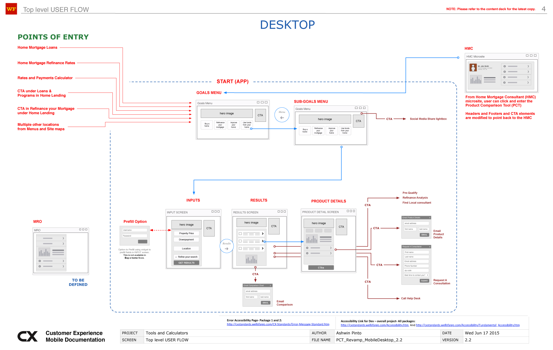
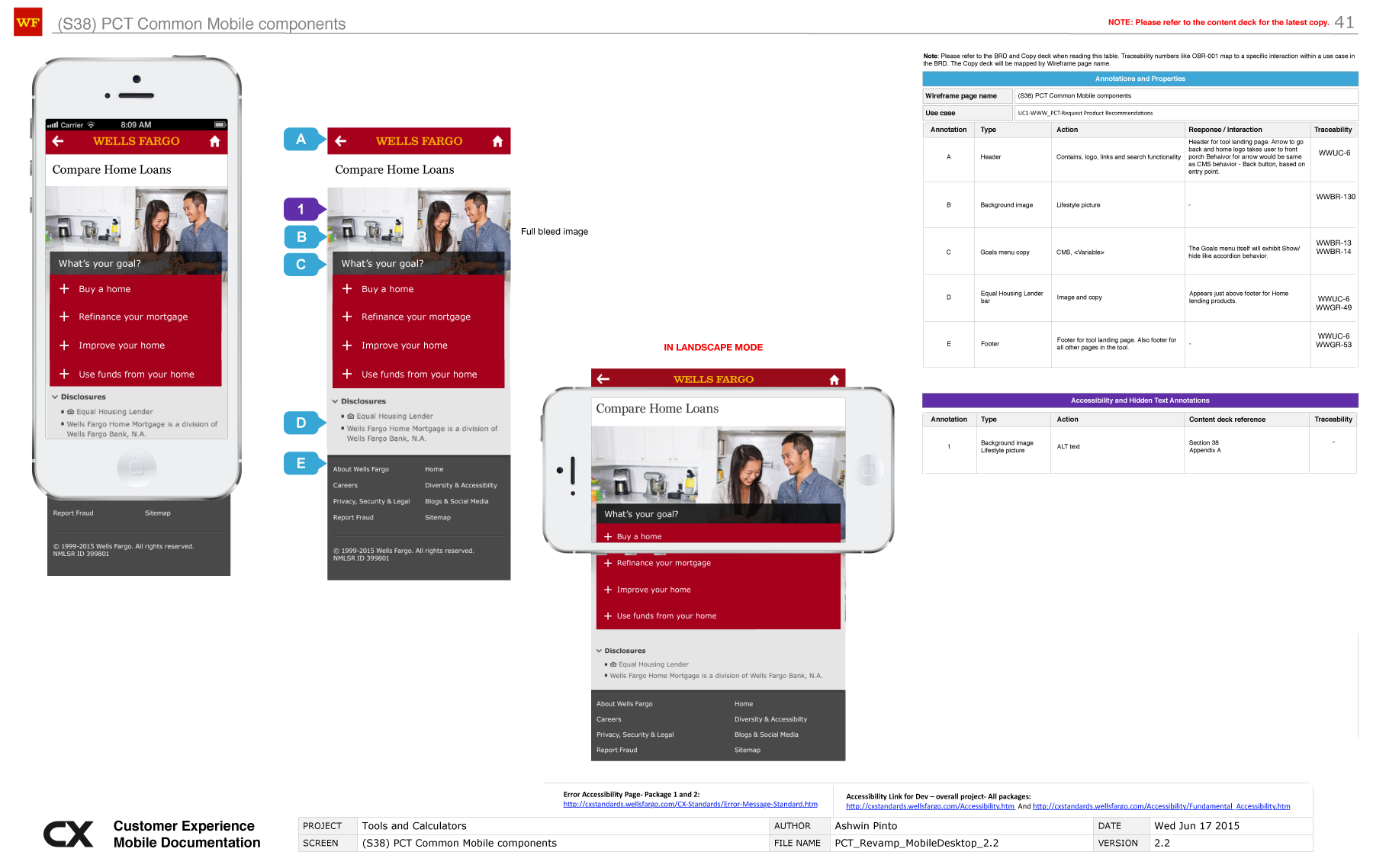
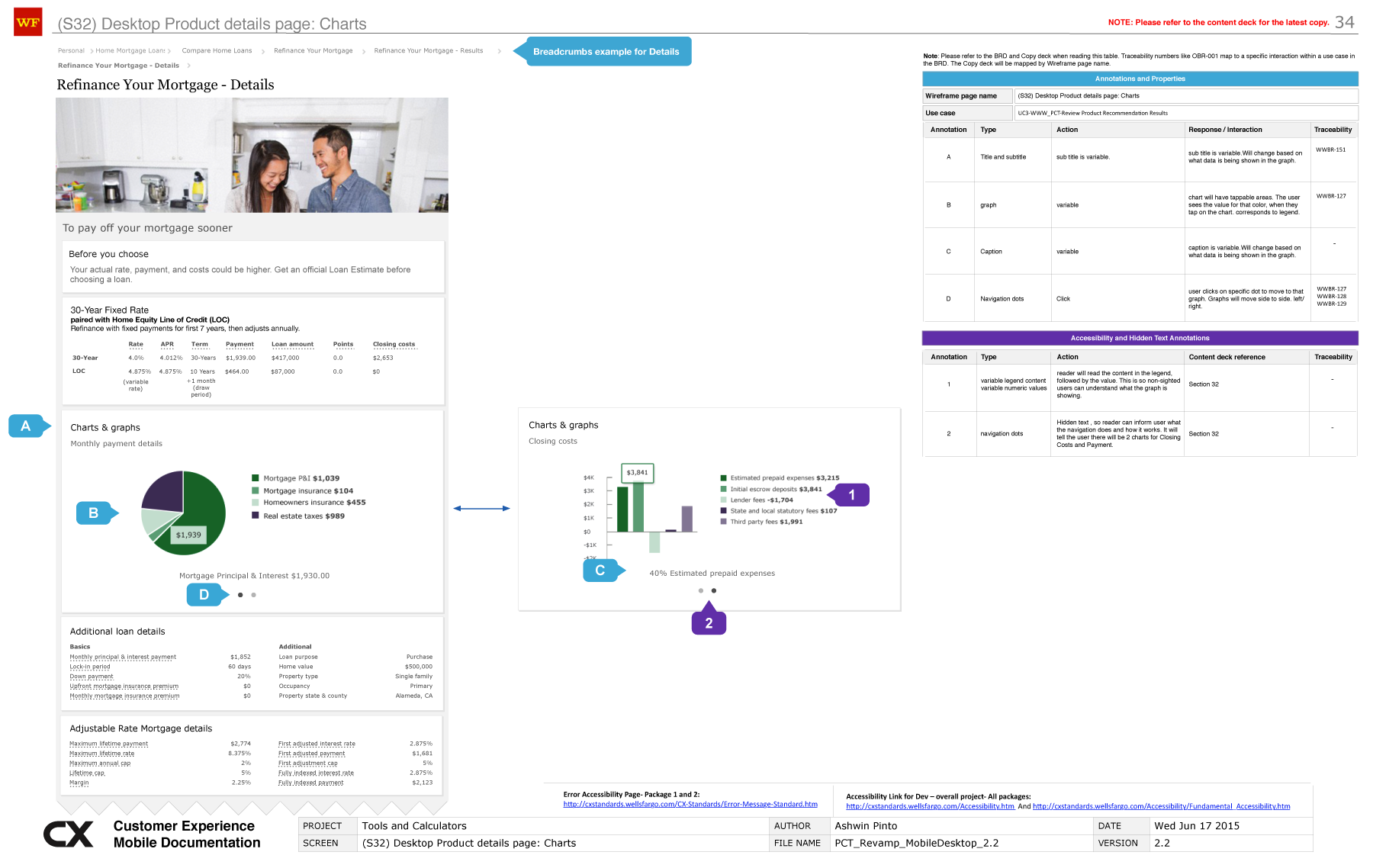
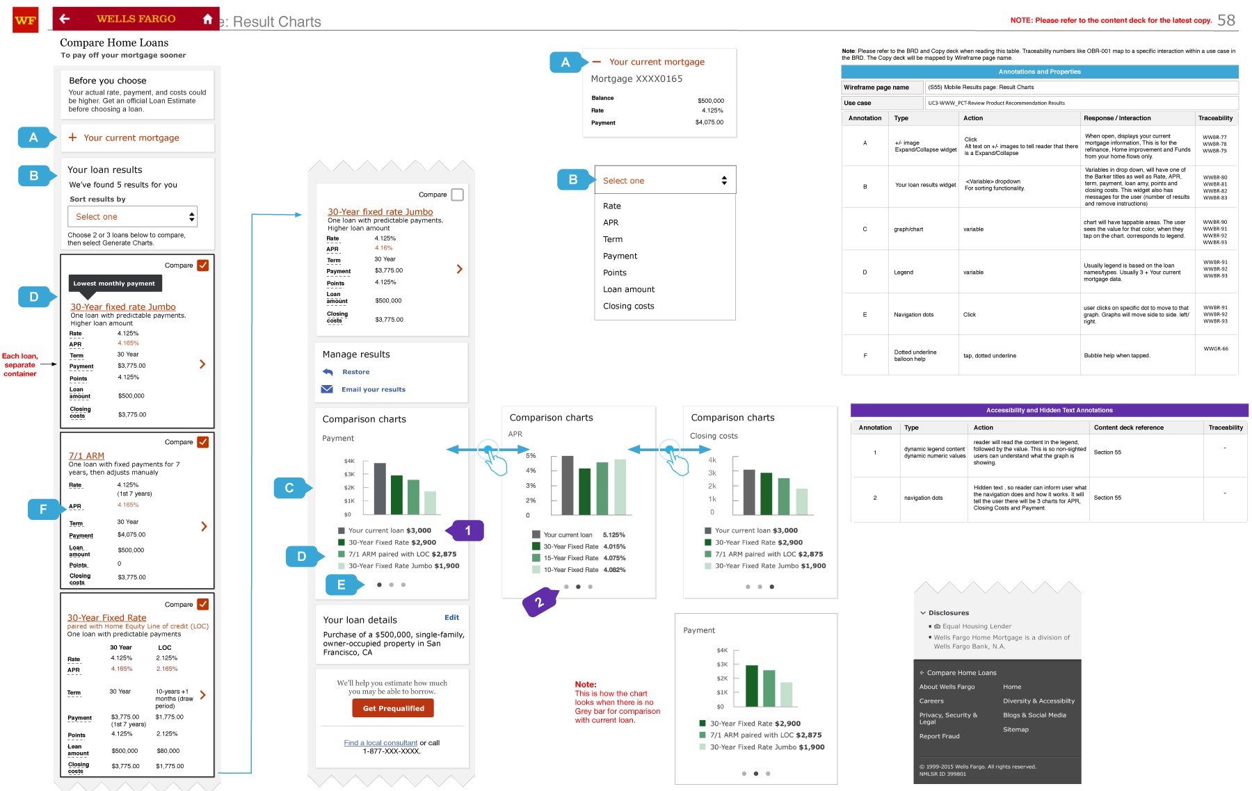
MORTGAGE RETAIL OPPORTUNITY (MRO) (AUTH/UN-AUTH)
- The problem: Following the 2008 recession, around 2014, Wells Fargo had its mortgage application process in place at banks and online, but the current set of tools, applications and calculators were scattered. Inconvenient.
- The solution: In 2015, a project started within Wells, with the goal of giving the prospective and repeat home buyer a portal, where they could explore their home lending options, use calculators, financial tools, a learning center and access to HMCs and agents and even a tool to find homes. It was called MRO and I was the UX lead on it..
- A lot of the initial work was meetings with stakeholders and cross-functional teams to try and figure out how much of legacy we could use and how much would have to be built from scratch.
- Process: I began with research on the current and competitors flows and tools across the internet that would be useful to build our version of. A week into research, I started building out a rudimentary Omnigraffle wireframe flow (see below) that was constantly iterated in countless working sessions with all my stakeholders. I did everything Ixd related, from wireframes and socialization to all levels of leadership, to accessibility, governance and other approval processes. I did prototypes in MarvelApp for User testing.
- It was truly an enormous undertaking, and kept me 100% allocated for two nearly years.
- Success: MRO launched in 4 phases from 2015-2016 and continued till 2018, when it was replaced by a Home lending design and functionality revamp and the Personalization project.
- Seeing that mortgages and home lending are Wells Fargo's bread and butter, it is evident that millions of applications and pre-approvals were generated by this project between 2015 to 2018, some of the most explosive growth years in real estate industry.
- Some wireframes, workthrough slides and screen flows from the project (below).
WELLS FARGO (2015)
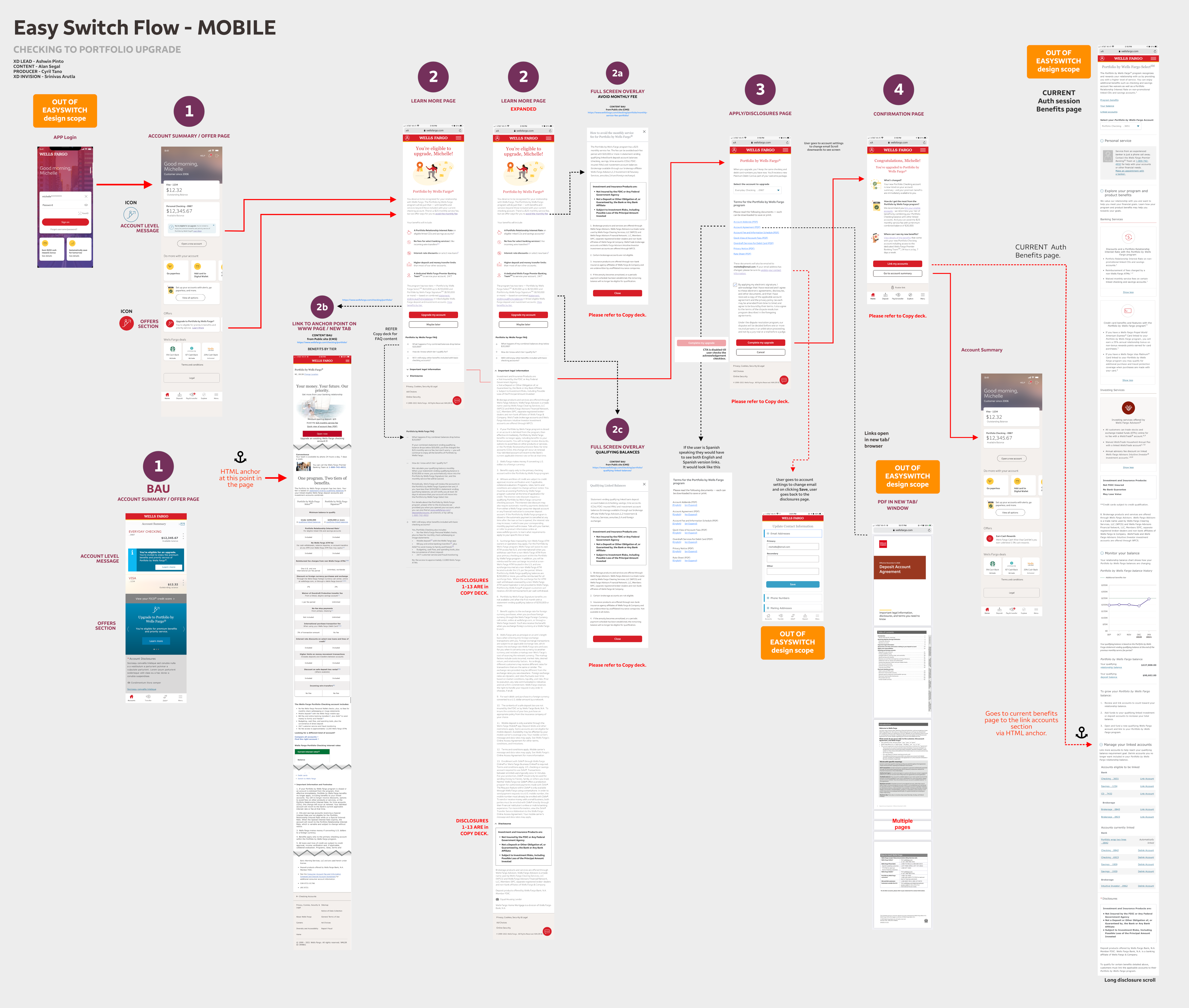
AN AUTHENTICATED SELF-SERVICE UPGRADE FLOW
-
MOBILE AUTHENTICATED SELF-SERVICE UPGRADE
- The problem: was that a self-service upgrade for checking accounts didn't exist, forcing users to visit a branch if they wanted to upgrade their accounts. The POE is the authenticated session account details, for existing users only.
- The solution: was to create a self-service option. I designed this service upgrade from end-to-end. Worked with LOBs and existing product owners and other stakeholders to create requirements, user stories and a strategy for guiding users to use it. Collaborated with internal UX resources. Tested it internally, Governance and Accessibility tested. Delivered to Dev.
- Created initial 'mobile first' wires in Sketch, a hi-fidelity end-to-end flow (shown below), then ported it into Figma and prototyped it for socialization.
- The product tested positively for usability and has just stagger launched in some zip codes. Metrics are pending.
WELLS FARGO (2022)
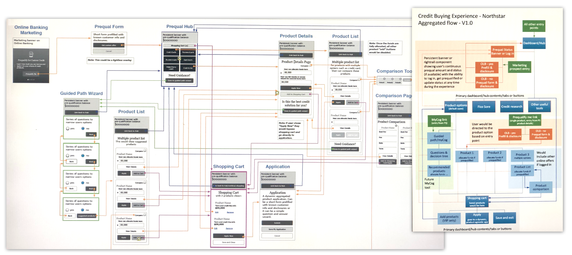
SMARTER CREDIT CENTER APPLICATION
-
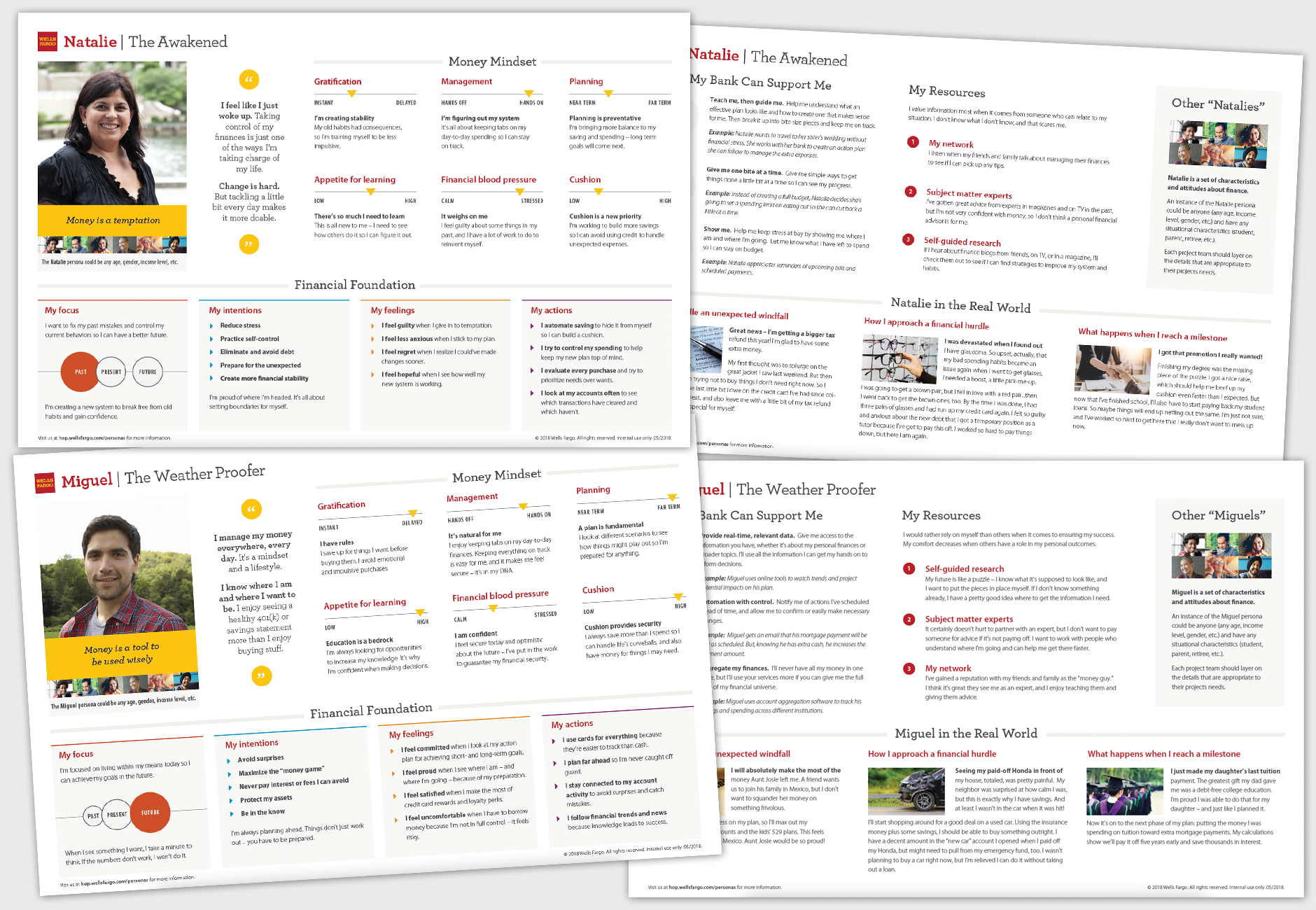
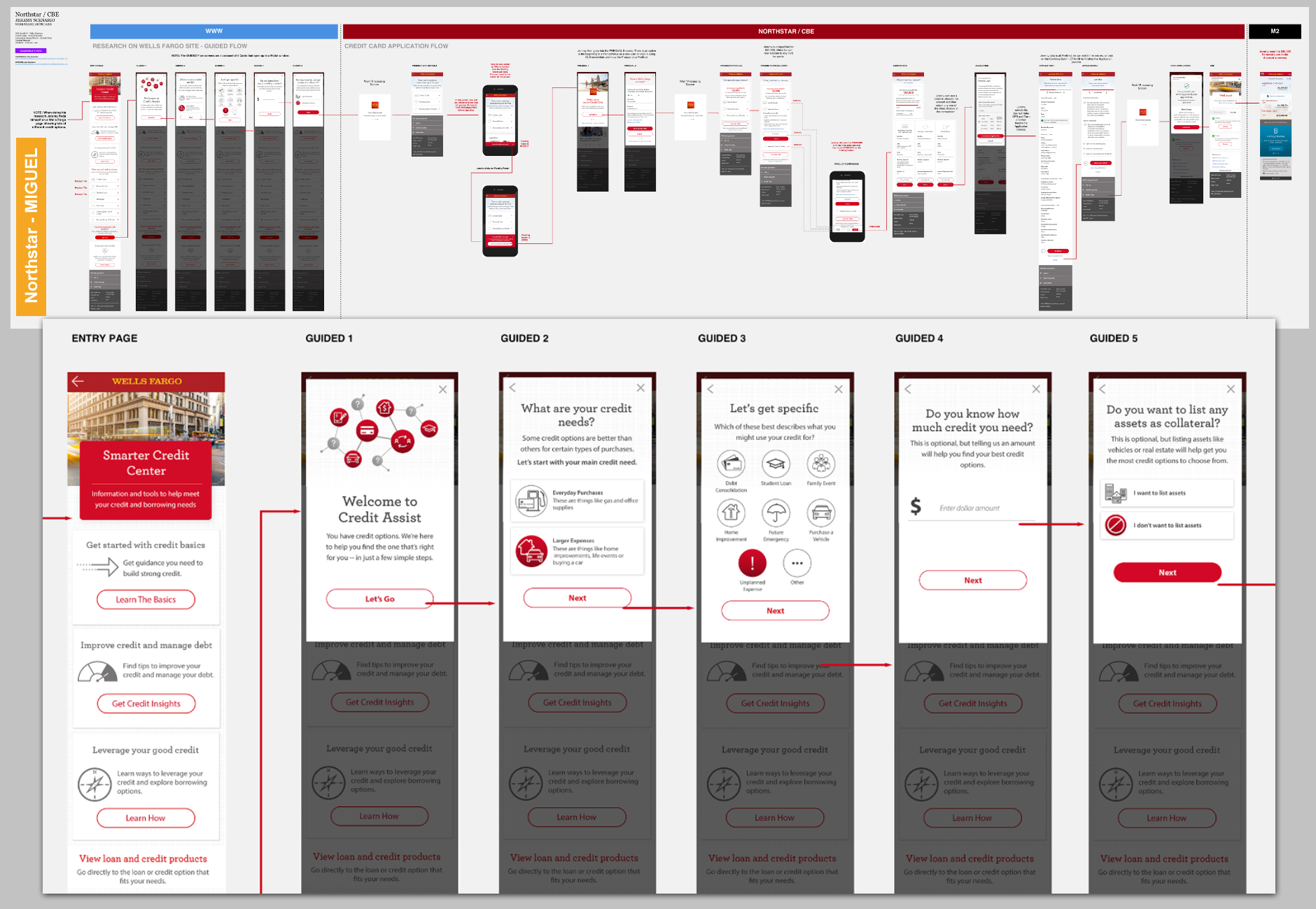
PERSONA DRIVEN MULTI-PRODUCT CREDIT APPLICATION
- The problem: was that WF credit product sales strategy was different for each product and the inability to effectively offer and cross-sell credit products to customers with strong credit profiles was leading to a loss in applications/sales.
- The solution: was to prequalify a customer for a credit amount that could be allocated across more than one product (eg:- Card + unsecured loan).
- I was the second IxD working with the UX lead to refine and develop end to end flows and Prototypes for testing. I collaborated with LOBs and stakeholders to create requirements, a testing script and a strategy for user testing. Some of the persona and throwaway work shown (below).
- Created a prototype in iRise and also end-to-end flows (shown below)
- The product tested positively but was de-funded towards the 75% mark, due to end of year budget cuts (It happens). I've always thought it was quite an innovative product effort.
WELLS FARGO (2022)
ACCOUNT APPLICATION/ONBOARDING REVAMP
-
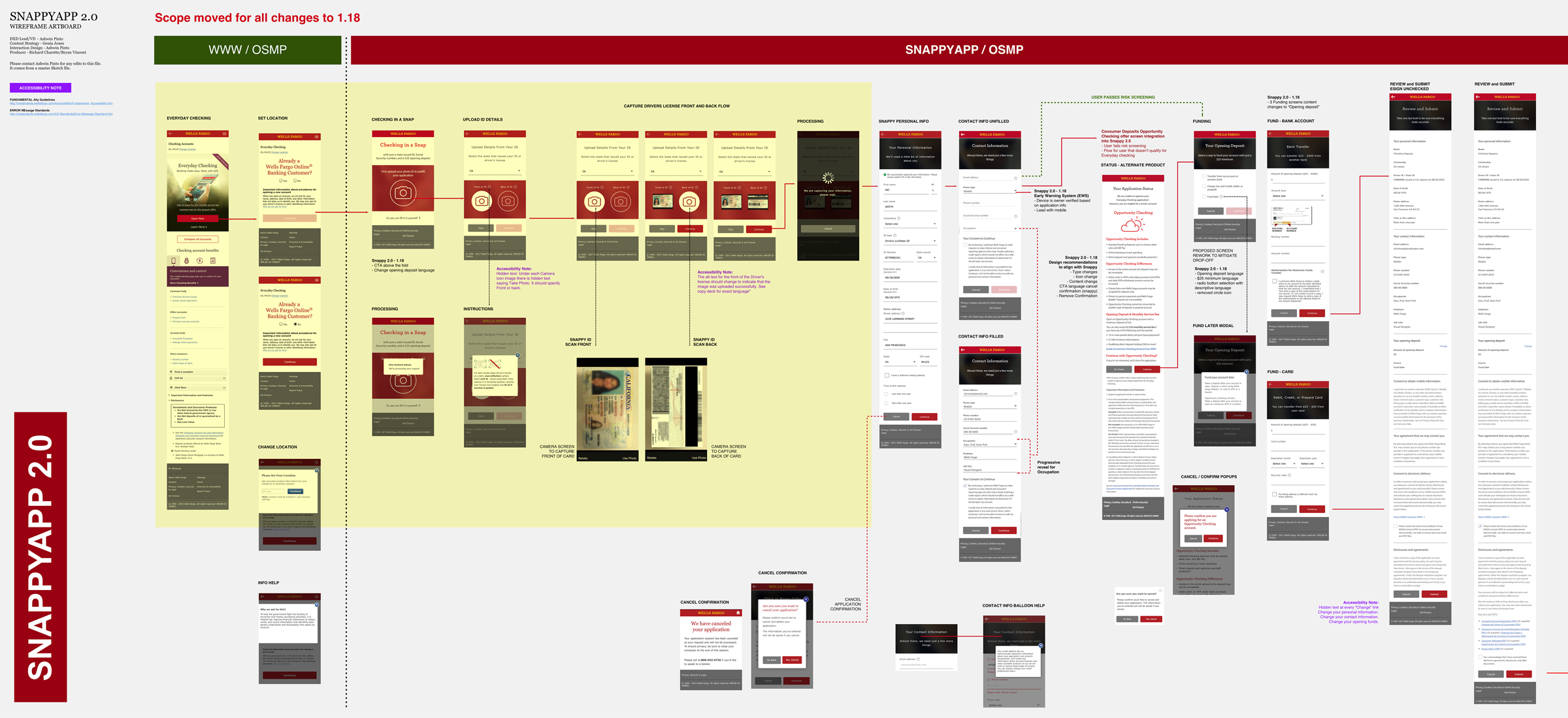
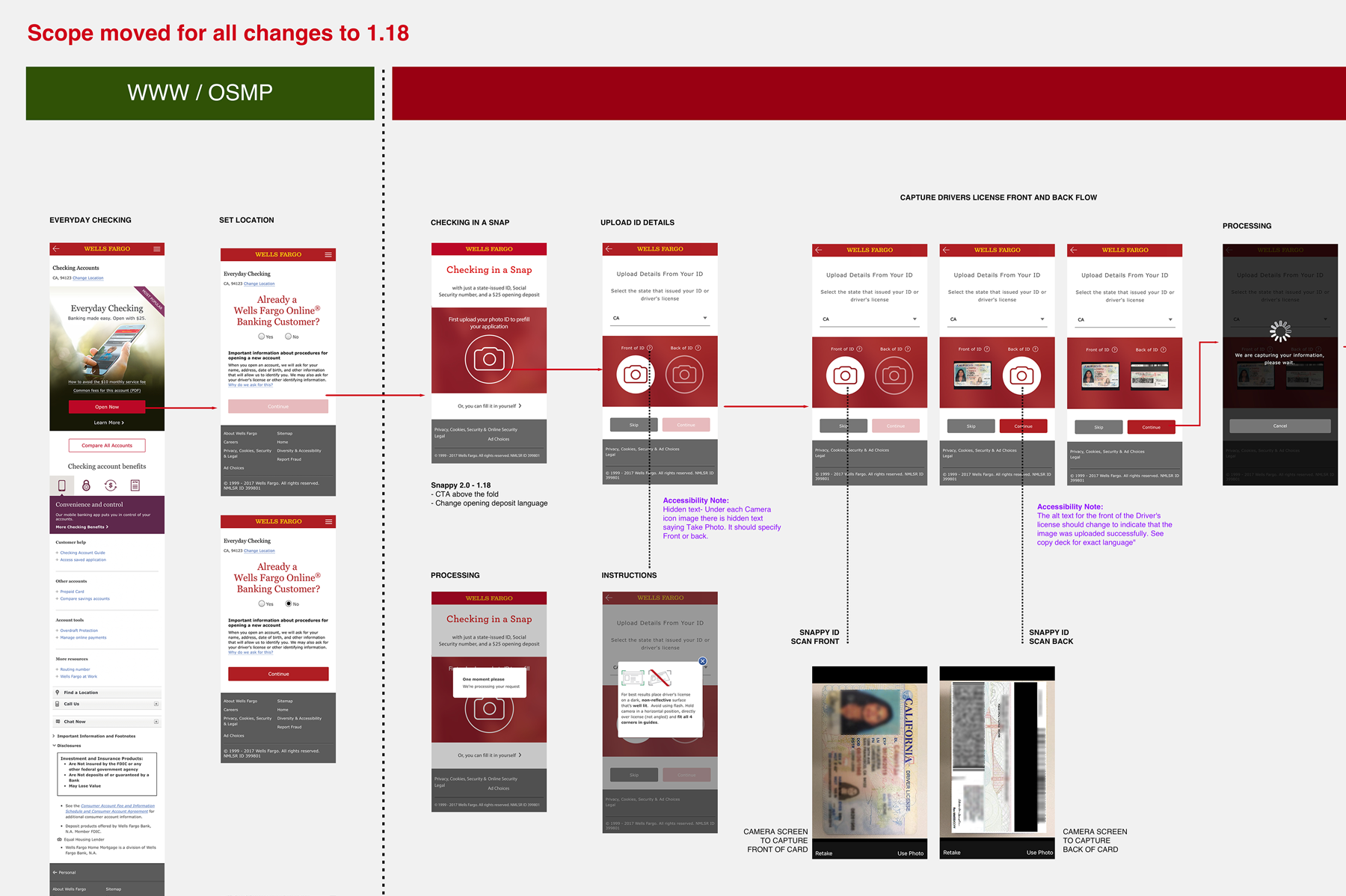
DEPOSITS PROJECT: SNAPPYAPP (DIGITAL ACCOUNTS OPEN)
- The problem: The online account application flow being a legacy system was in dire need of a revamp and streamline functionality wise. It was long and the bounce rate midway through applications was tremendous.
- The solution: Analyze the current process and revamp the flow to streamline and integrate newer technology. Search for pain points ad remedy.
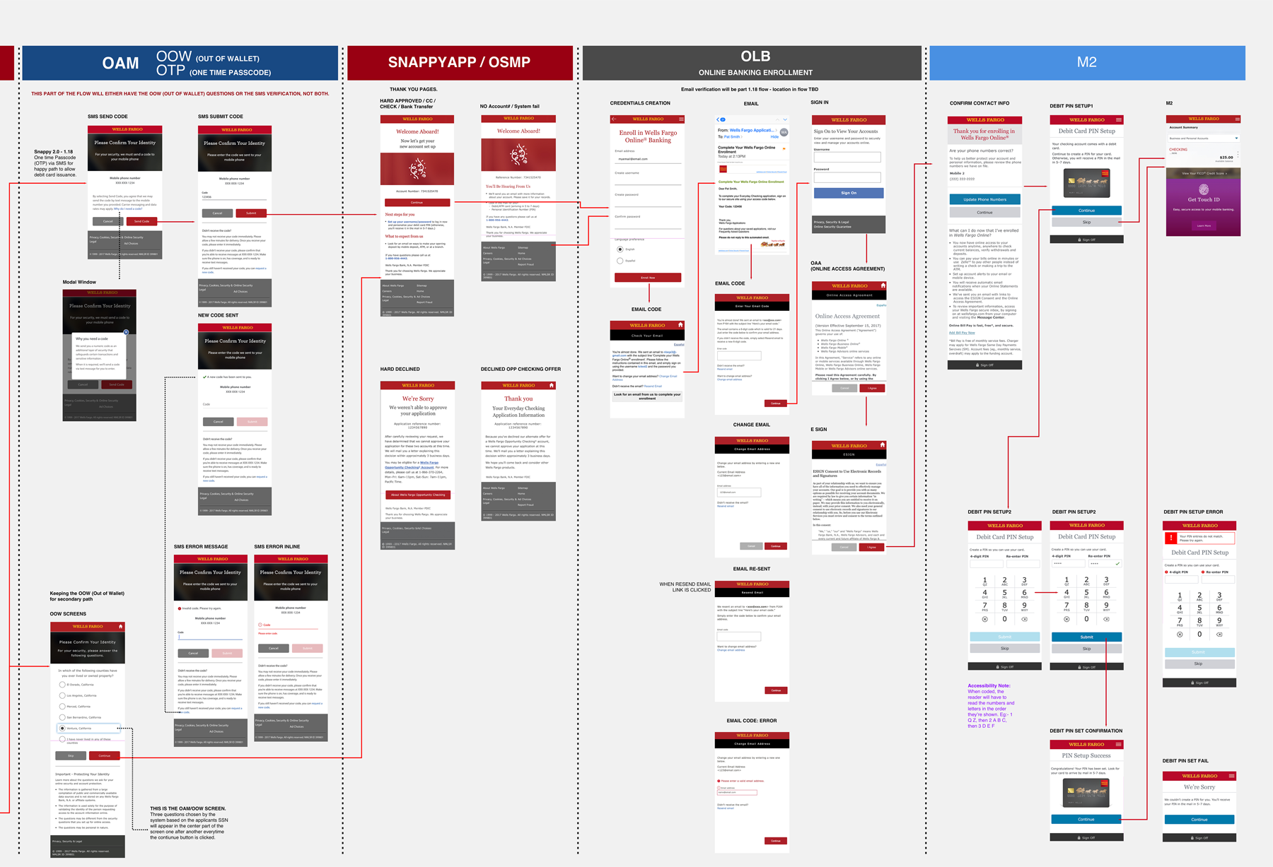
- Process: This project was called "SnappyApp" internally. I was the Product designer/UX lead.
- This project moved at break neck speed from the get go. I was part of an Agile tiger team with daily standups and working sessions. It was an existing product, so it was decided that we would work through high fidelity real-time updates through daily work sessions, with analysts, BAs, LOB, UX and dev stakeholders in attendance. Used Sketch and Invision for wires and prototyping.
- It was truly Lean UX. A couple of innovations I helped integrate were the pre-filling of application info from the users driver license, by merely snapping a photo of the front and back. I also worked on improving the consistency of the design as it jumped in and out of legacy systems.
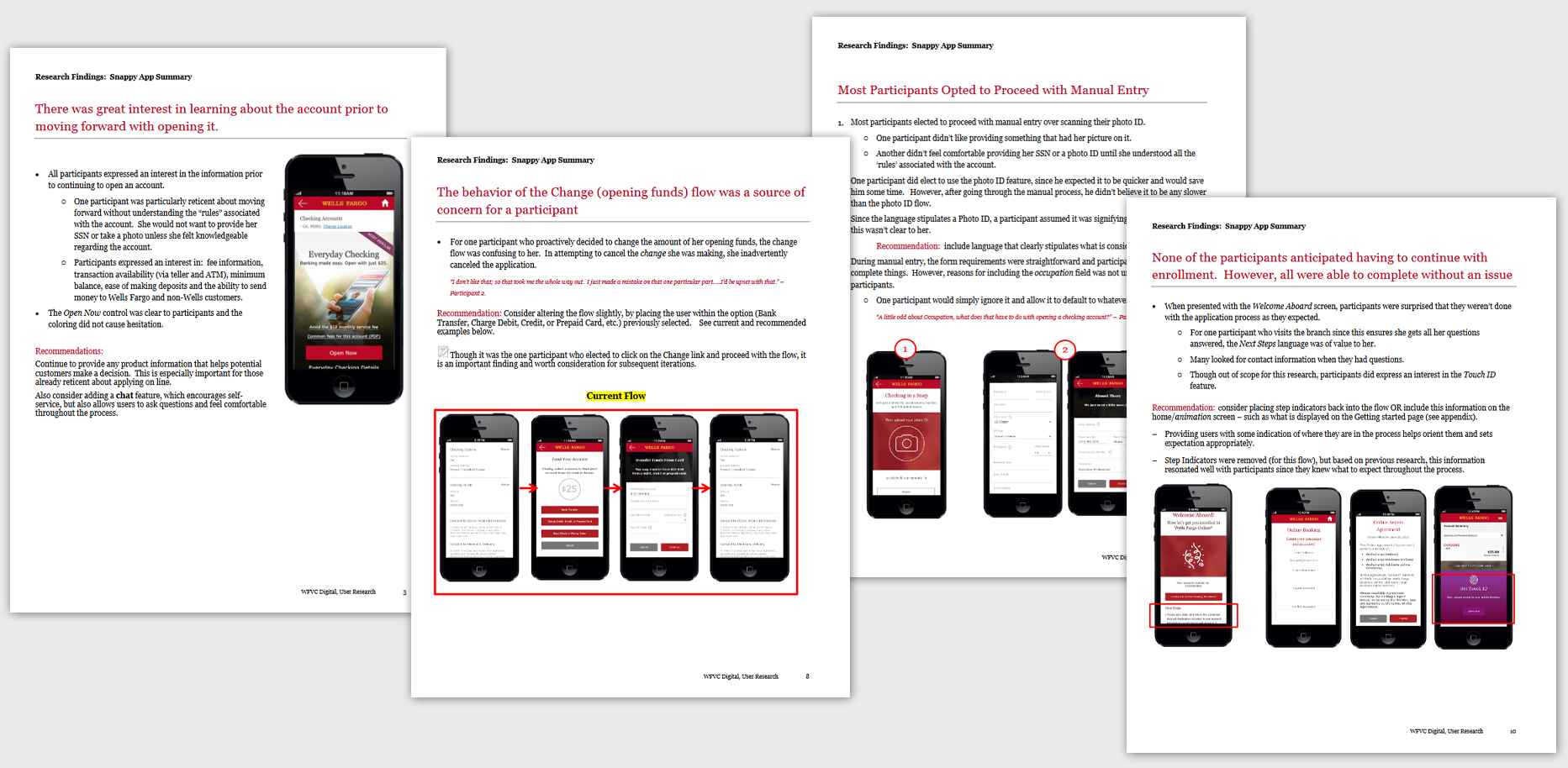
- Success: The product tested well in the two user tests (see below) we did, with multiple edits and pivots.
- The new application flow went live in 2017 with constant improvement releases over the next year.
- I took over the Auto dealership project in Q4 2018 and handed over this project to a newer designer who I mentored and brought up to speed.
- SnappyApp was the in-place solution and funnel for millions of online incoming deposit product applications from 2017-2020. It was retired in 2021, when the DNG (Deposits Next Generation) project took over. I am currently the product design lead on DNG.
WELLS FARGO (2016-2019)
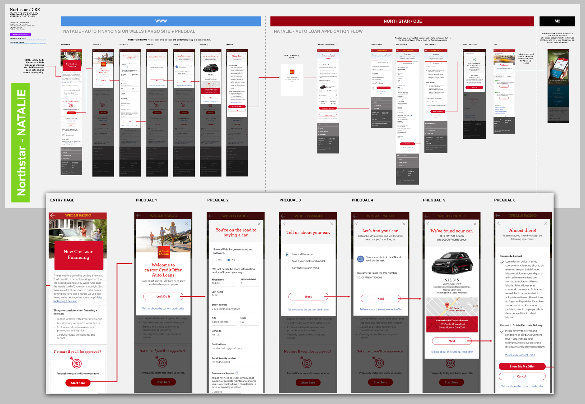
AUTO FINANCE SUITE
-
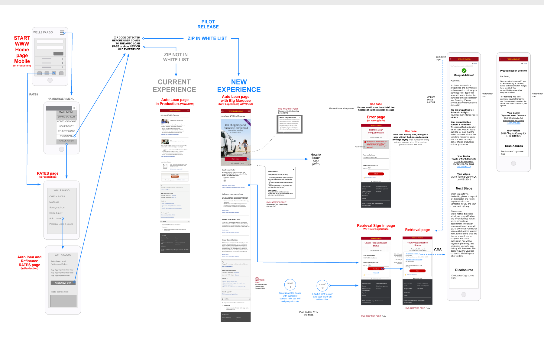
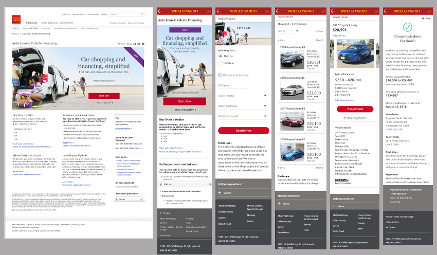
AUTO DEALER PROJECT
- The problem: was that Wells Fargo wanted to do more than just offer auto financing online. There was a demand for more tools and functionality.
- The solution: was to create a self-service dealership integrated tool, wherein the user could financially pre-qualify themselves and choose a car on the Wells Fargo site itself. Then all they had to do was go to the dealership and pick up their car with a code.
- Process: This was one of the most exciting projects for me, because I am a car nut, and I've experienced dealership headaches as a user first hand and knew exactly what an attractive solution looked like.
- I started with research of all tools and sites out there that offered online car searches and browsing. I also researched financing options by our competitors and any cases where there was an overlap.
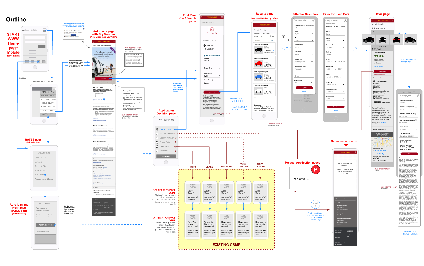
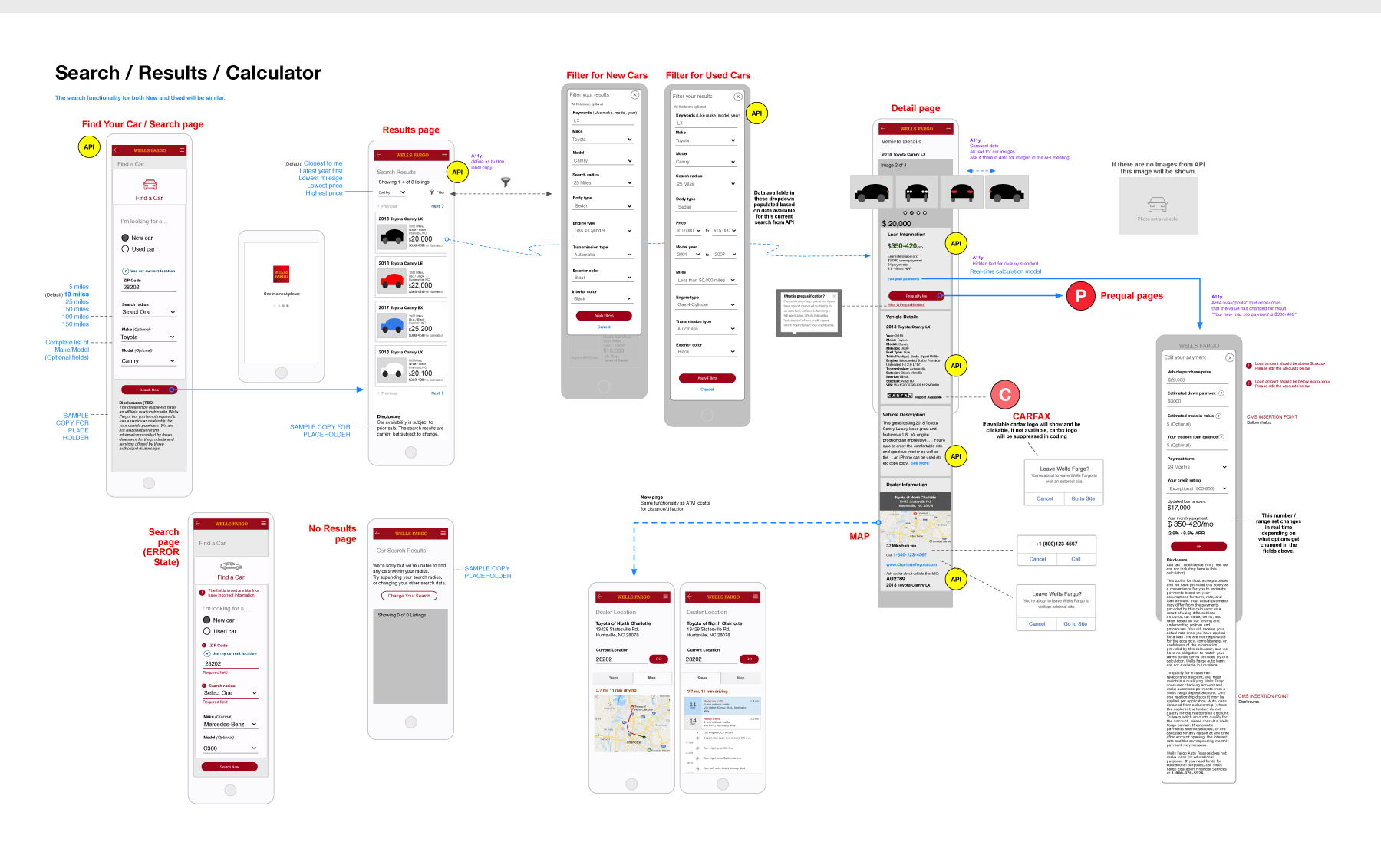
- I then began whiteboarding and sketching solutions on paper before I laid out the entire flow from end-to-end in Omnigraffle (see below). Worked with LOBs and existing product owners and other stakeholders to create requirements, user stories and a strategy for guiding users to use it. Tested it internally.
- Created initial 'mobile first' wires in Sketch, a hi-fidelity end-to-end flow (shown below), then prototyped it in Invision for socialization.
- The product tested positively in two listening labs. However there was a contract problem with the dealership API integration partner and the project was shelved till a solution could be found. I think it would have been a very usable and efficient solution.
WELLS FARGO (2017)
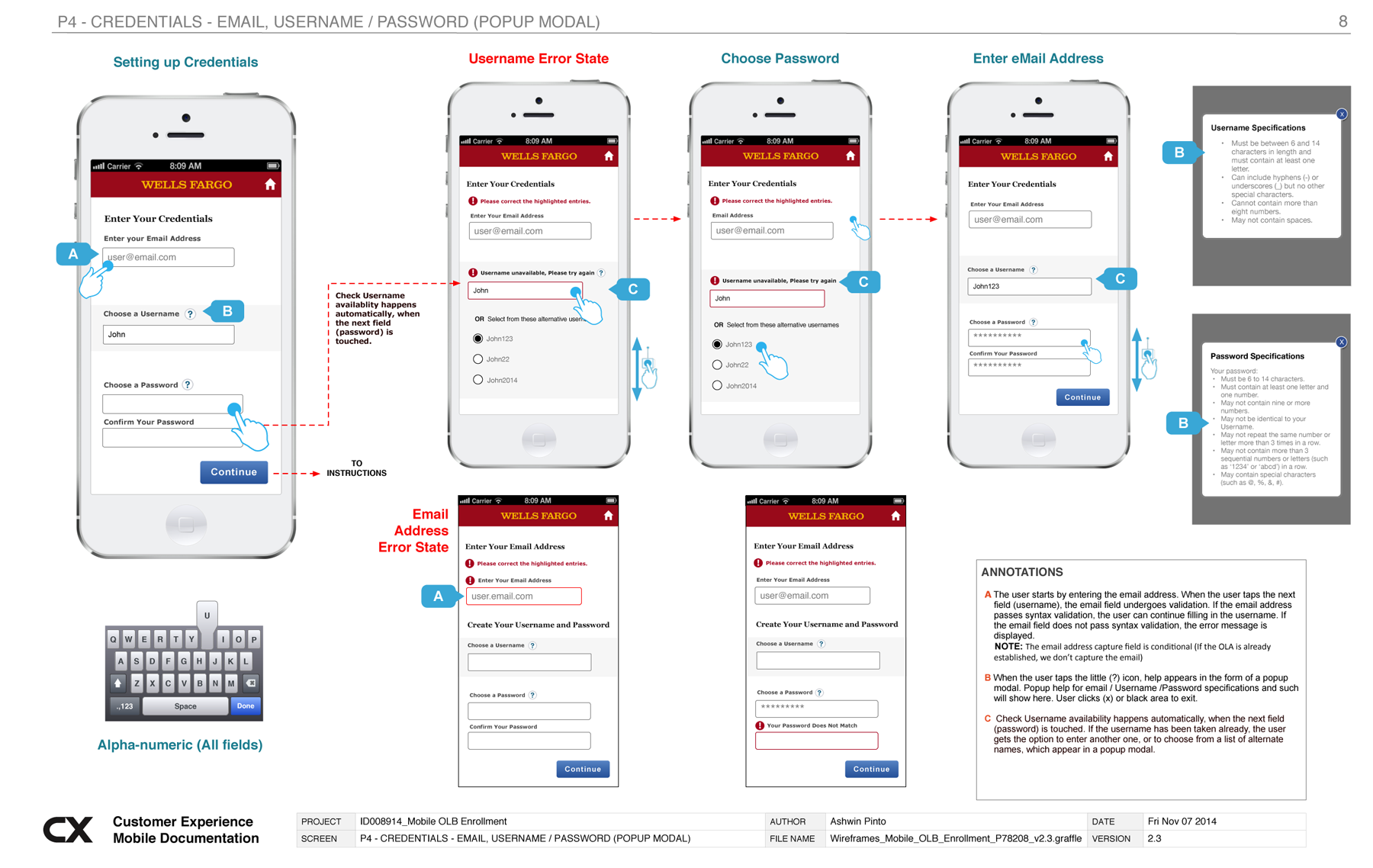
EXAMPLES OF ANNOTATIONS
- I've been asked, "How detailed do my annotations get?" and the simple answer, As DETAILED as is required. But best practices are always followed, even if annotations are minimal...
- Usually my annotations include: Introductory screen with team and project details, a change log, documenting nuances of the flow, showcasing specific use cases, showing error and edge cases, describing off-screen experiences, sharing design rationale, tracking pivots and decisions.
- Annotations were a thing from 2011-2018, but over the last couple of years at Wells, we've switched over all our annotations and deliverables to Invision and Figma files, (Components, Fusion libraries and Figma inspect) so we don't really create doc files or PDF documentation anymore..
- Have a look at a couple of older examples below
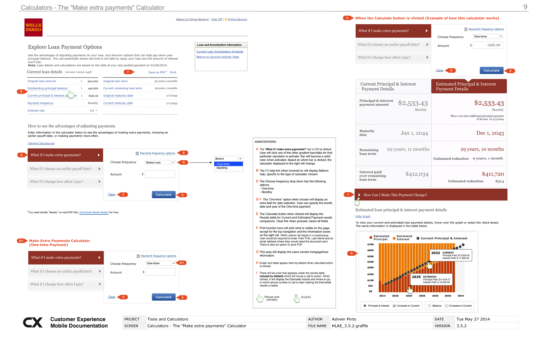
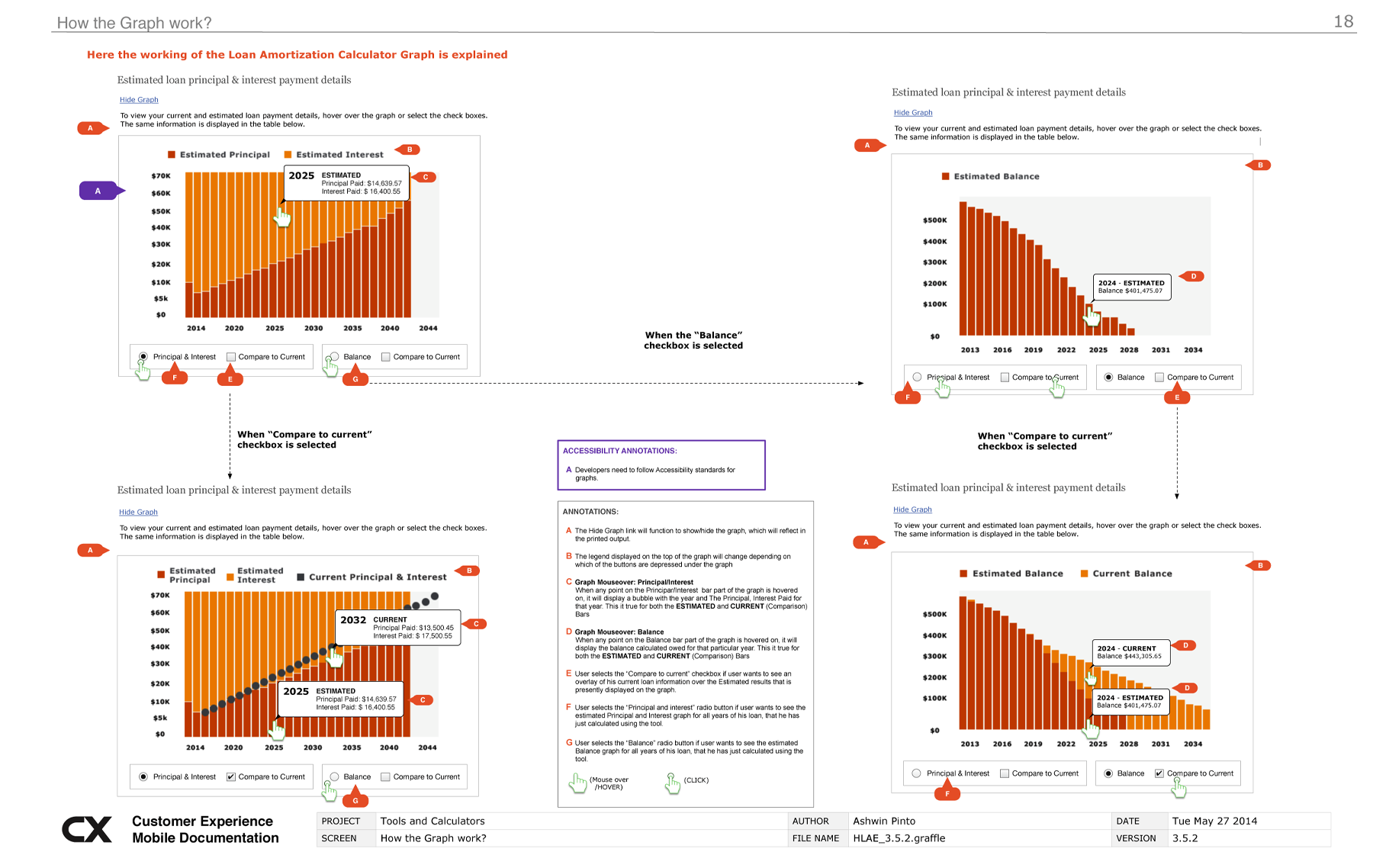
ANNOTATED WIREFRAMES FOR AN AMORTIZATION CALCULATOR
WELLS FARGO (2014)
-
ANNOTATED WIREFRAME FOR A LOGIN FLOW
WELLS FARGO (2014)
ANNOTATED WIRES FOR A MORTGAGE TOOL
WELLS FARGO (2015)